It’s us, worry-free food for everyone.
Client: Ollie (agency job)
My role: brand strategy, brand name, corporate identity and packaging
Year: 2019 - 2020
Gluten-free is a fast growing segment in today's supermarket. However, a pack of brands are quite 'boring' and approach the category from a medical point of view. The challenge with this project was to create a brand that was broader than just the medical need.

Brand name & corporate identity
For the brand name we wanted something that stood out in the category, a name that hinted at the new proposition. A brand that develops products together with consumers, not for them. After thorough exploration and legal checks we came up with 'It's us'. After a brand name of course came a visual identity, here it was important to convey a playful and authentic image, different from the competition.
Logotype
Logo and tagline
Packaging logo
Typography: The main eyecatcher is the ‘Gastromond’ typeface. Paired with a playful script and sans serif.
Packaging
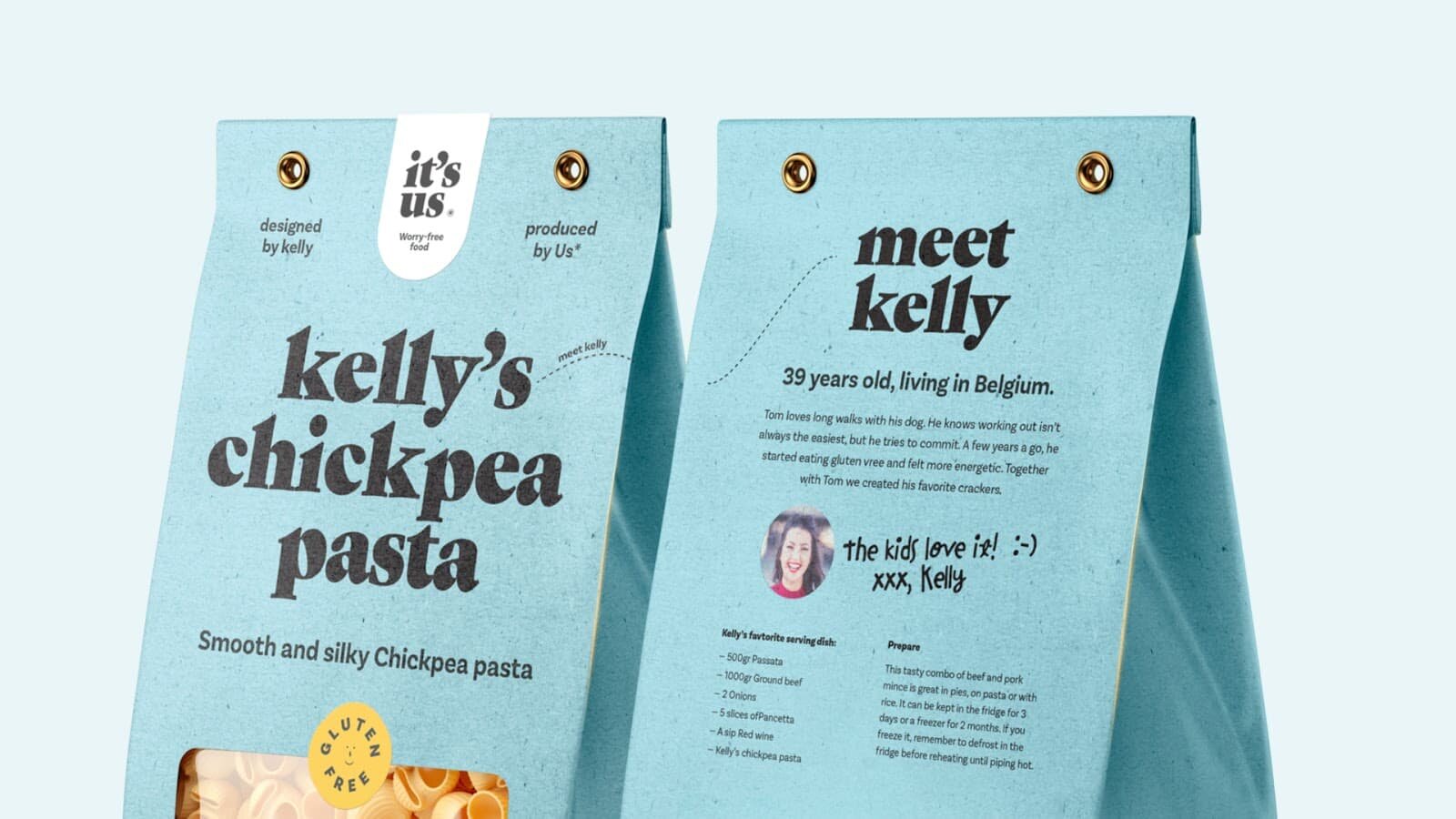
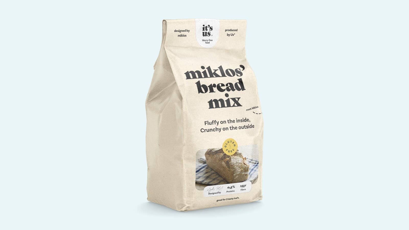
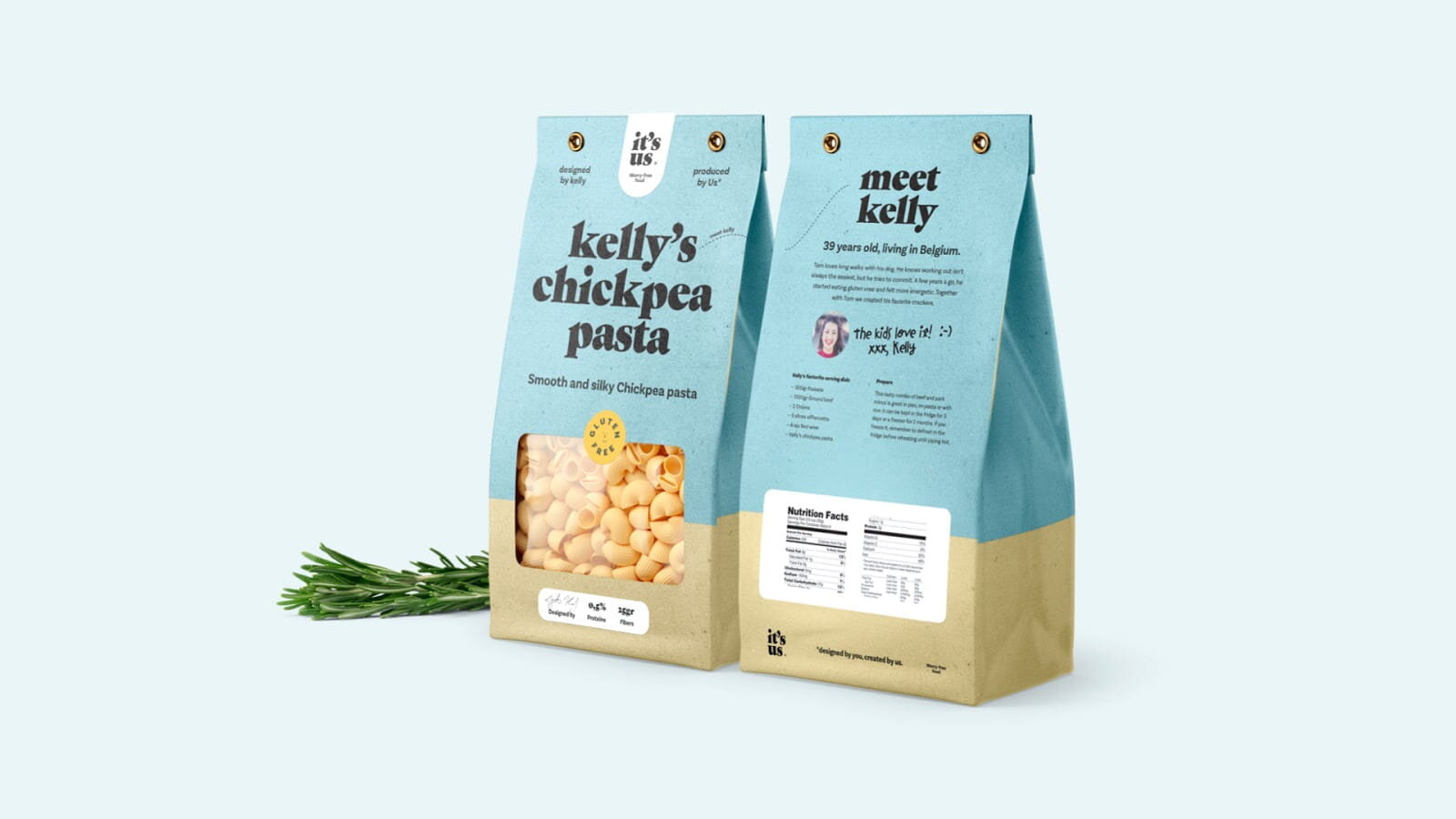
Packaging was obviously the most important element of this brand, for CPG brands attractive and distinctive packaging is crucial. At It's us, I was responsible for the design of this packaging. The packaging also has the playful, artisanal look and feel and builds on the strategy.
A fresh colour palette with soft colours like beige and blue combined with brighter colours like yellow to accentuate the playfulness.
There is also an important brand message in the product names. Each product has the name of a consumer or founder of the company. For example, you have 'Maria's breadcrumbs', Kitti's chickpea pasta, etc...


Each product has its own 'ambassador' who, together with the company, further refines the taste. We tell something about that consumer and his link with the company.
“We are extremely pleased with the cooperation with Stef. Stef and his team carried out the briefing perfectly, both for the development of our new brand "It's us" and for the design of the logo and packaging. We especially appreciate the direct contact, creativity and flexibility. Stef knows how to empathize with what is good for the consumer. And that is an absolute added value!”
Alain De Bruyn – commercial director It’s us


